Working with data grids
On this page
Overview
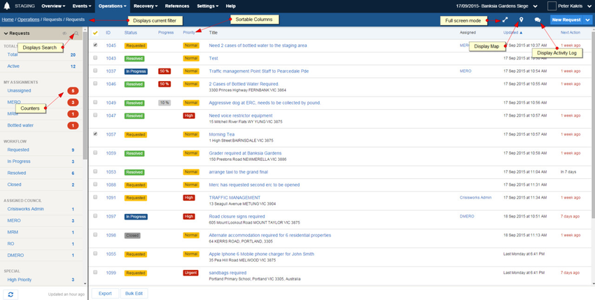
All modules have a grid view interface for viewing data, called a data grid.
The grid view reads similarly to a spreadsheet. In addition to displaying records within a module, the data grid enables sorting, filtering, searching and bulk management functions and in some modules, a map view.
Generally, a data grid can be viewed by clicking on a menu or an option within the menu, for example Operations or Operations > Requests. If a top menu is selected, the data grid defaults to displaying the first module in the menu.
data grids are broken down into two main sections - the data grid and the sidebar.
View options
Many data grids have additional views options:
| Projector Mode This mode presents the data in a view that works well with projectors, and sets up an auto-refresh cycle. |
|---|---|
| Map For registers that store geospatial content, this shows an integrated map that maintains a synchronised view of data in the data grid. |
| Activity Log Shows or hides the system's activity log sidebar, which keeps you up to date on changes made by others, and allows for quick log entries to be posted. |
| Search Mode Click this to hide the counters and display the search form, allowing for more detailed searches and filtering of content. |
| Show Hidden Counters The system normally only shows counters that are active. Click this to show inactive counters (e.g. counters that have a value of 0) |
| Refresh Click to refresh the counters and data grid with the latest content from the server |
Working with counters
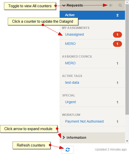
A data grid's sidebar contains counters that display the number of records for that filter.
These counters are pre-set filters that show the most relevant and important information for the data being displayed. Clicking on any of the counters will update the data grid to match the counter filter displayed.
Each register has its own set of counters. The counters displayed in the sidebar are relevant to the data being viewed in the data grid and to your position and organisation.For example the request counters display the number of requests assigned to your position(s), the number of unassigned requests, the number of active requests.
Register counters are grouped by modules which can be expanded to view that specific register's counters within that module. For example in the Operations section, the counters are grouped by the Requests, Information, Offers, Logs and Contacts registers.
Expanding a module to view its counters
To view counters for a module:
- Browse to a data grid from the top menu (e.g. Operations > Requests)
- The selected module's counters will automatically be displayed, but related modules will be collapsed.
- Click on the arrow next to the related module (
 ) to display its counters as well. You can expand multiple modules at once.
Please note, the data grid will only be updated when you click on a counter, and not on a module name.
For example, clicking Information will expand the information counters, but the data grid will only be refreshed to show information records once you click one of its counters (e.g. Total).
Using a counter to filter for data
To use a counter to filter for its data:
- Click on the counter name or the counter number
- The data will be displayed in the data grid
Viewing hidden counters
Only active counters are displayed by default, but you can click the Show Hidden Counters button to show inactive counters ( ).
).
Refreshing counters
Counters and lists filtered from counters refresh automatically as content is changed at the server, however sometimes you may wish to manually refresh the list.
To refresh the counters, click the Refresh button ( ).
).
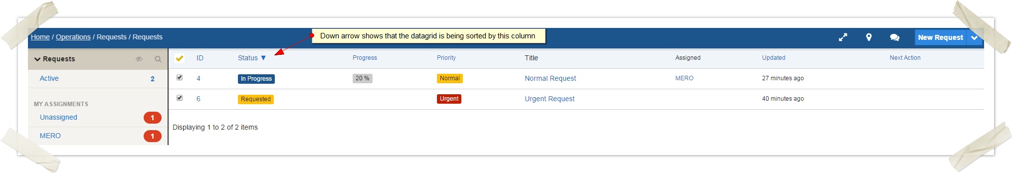
Sorting data
Most columns displayed in the data grid can be sorted in ascending or descending order. This means that all of the data in the data grid will be sorted by that column. Any columns that are sortable are displayed in blue.
An arrow is displayed next to the current column that is being sorted. A down arrow is displayed if the column is being sorted in ascending order. An up arrow is displayed if the column is being displayed in descending order.
Only one column can be sorted at a time.
To sort data:
- While viewing a data grid, click on the column heading that you wish to sort by. This will update the data grid so that the data being displayed is sorted in ascending order by that column. A down arrow will appear next to the column heading.
- To sort the same column in descending order, click on the same column heading. A down arrow will now appear next to the column heading
- To change which column the data grid is being sorted by, click on a different column heading
Searching and filtering data
All data grids have a basic search feature to filter data in the data grid, which is exposed by pressing the search icon ( ).
).
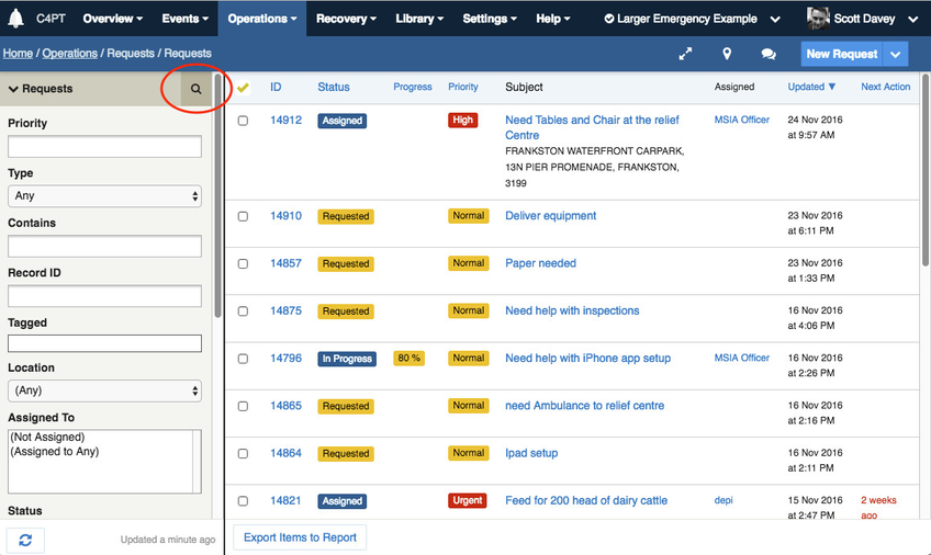
The filter form that displays is contextual and differs for each register.
Search filters persist until they are either cleared or another search filter is applied. The filter will remain when navigating to other modules or screens and will still be there when returning to the system.
The following types of filter are commonly configured:
| Text filters | allow you to enter keywords |
|---|---|
| The Contains filter | performs a full-text search within records and their attachments |
| Selection filters | allow you to select an item from the select box. The default selection is "Any" which searches for all items in the list. Choose an item from the drop down list if you want to search by a particular selection in the list. |
| Multi-selection filters | allow you to choose more than one selection in the box. To choose multiple items, press Ctrl while clicking on the items you want to select in the box |
| Date filters | will allow a date (and sometimes a time) to be selected |
| Tag filter | allows searching for records having specific tags. To search for multiple tags, separate each tag with a comma. By default Crisisworks will return all records matching any tag, but you can also return only records having all the specified tags by adding a "+" to the beginning of the search. e.g. "wheelchair, inspection" will return cases having either of the tags, while "+wheelchair, inspection" will return only cases having both tags. |
| The Location filter | exposes the data grid map, and allows searching by radius around a point, and by a polygon drawn on screen. To use, select the type of geometric filter from the pull-down list, then draw on the map. |
Tip: If a Contains filter is present, this provide a full-text search across all items in the current event.
Applying a search filter
To apply a search filter:
- Start in the data grid you wish to search
- Click the search icon to expose the search form
- Select options as required to configure the filter
- Click Apply at the bottom of the form to apply the filter. Alternatively, press enter in any of the form elements.
Note that the Apply button may be initially off screen and you will need to scroll the form to view it.
Clearing a search filter
To clear a search filter, click Clear Filter at the bottom of the filter form.
Data grid actions
Some data grids provide bulk management functionality, and this varies module to module.
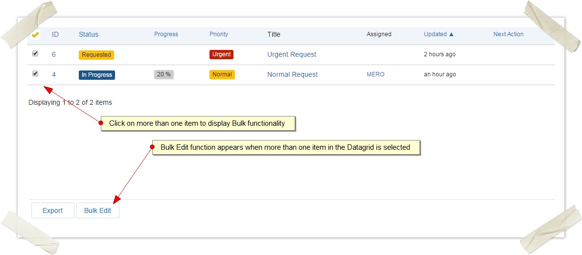
The data grid will only show buttons that apply to the selection.
- From the data grid, click the checkbox for one or more items.
- Alternatively, you can click on the yellow tick column heading to select "All" items, which toggles between selecting all and selecting no items. Selecting all items includes all items in the current filter, which may include items that are not on the current page.
- If any bulk functionality can be performed, a series of bulk buttons will appear at the bottom of the data grid.
Bulk editing items
A bulk edit utility is commonly included for most modules.

To bulk edit a number of items:
- First, select two or more items in the data grid.
- Click the Bulk Edit button at the bottom of the data grid
- Only limited fields can be edited — this includes Assign To, Status, Due Date and Tags.
- For any select boxes, a "Don't Change" option will be displayed. Choose this option if you do not wish to update this field. Alternatively, choose an item from the select box.
- Change all of the necessary fields and click the Make Changes button
Note - workflow rules will be adhered to when changing the status of items. If you are changing the status of items and there are errors, generally they are based on breaking workflow rules. This means that only some statuses can move to other statuses - for example, for Recovery Cases you cannot change Open to Closed in one step. You must go from Open to Resolved, then from Resolved to Closed.

Exporting data
An export utility is commonly included for most modules.
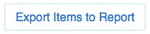
To export the data into a report:
- First, select one or more items in the data grid. You can also use the select all feature to export all records in the filter.
- Next, click the Export Items to Report button at the bottom of the page
- On the following screen you can
- configure the columns to include in your export
- group the data by a column
- order the data by a column
- Press Run Report to run the report
- When the report has finished, it will show on screen. Scroll to the bottom of the report and click the Export to Excel or Export to CSV button to export the data.